Repression is the attempt of an individual to repel one's own desires and impulses towards pleasurable instincts. This suggests a psychological element to the film and gives a brief overview/ sums up the basis of the plot. This is written in a bold blue font as I thought this would fit in well with the dark colour scheme, and blue is often a colour associated with melancholy.
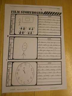
The main image is multi-layered. The main emphasis is on the large clock face, this causing the audience to question the significance of time. In the foreground is a man stood vacantly, where we also see vein-like brain cells trailing to the outer edge of the clock, this supposed to suggest connotations of memory. The size comparison between the clock and the man make the clock appear overpowering as if time is tormenting/ controlling him. The brain cells are supposed to appear as if spreading/ gripping on. This emphasises the idea of his memory getting the better of him. The clock is the iconographic image here, drawing the theme of time.
The tagline "Lost time is never found again" suggests someone is reflecting on the past as if in a battle with time. This strengthened by the imagery, it again draws the theme of memory and time.
The actors name can be found directly above the male character. This makes the actor recognisable to the audience, and with only one actor on the poster it suggests he is the main character and focus in the film. This could also be a possible USP. Positioned in the centre of the poster appearing vacant and expressionless shows him to be vulnerable. He is dressed in his work clothes, with his shirt half hanging out, his collar and tie loosened. This emphasises his state of being, one in which is breaking down.
The billing block will be found conventionally at the bottom of the poster.
I think the main pleasure/ experience being offered to the audience is the mysterious element. Nothing is given away of the plot, only addressing the main themes. The audience will be intrigued as a result, wanting to go watch the trailer to gather a more detailed picture, then leading them to watch the full length film.


