Thursday, 9 May 2013
Tuesday, 7 May 2013
Saturday, 4 May 2013
Wednesday, 24 April 2013
Tuesday, 23 April 2013
Monday, 22 April 2013
Sunday, 21 April 2013
Saturday, 20 April 2013
Focus Group Questionnaire Results
1. What gender do you think our trailer predominantly targets?
Two people though the ending gave too much away, however thought the music resembled that of a real trailer.
Six people thought the opposite - it kept questions unanswered, made them to want to see more, intriguing.
- Male 1
- Female
- Both 7
2. What age range do you think our trailer targets?
- 15 - 25 1
- 15 - 40 3
- 18 - 25 2
- 18 - 40 2
3. What genre would you say our trailer is?
All of the focus group thought that the genre was psychological thriller.
4. Depending on the genre you have chosen, what elements of the trailer suggest this?
Mental Illness
Mental Illness
Drugs
Time
The loneliness and the obsession
Panic Elements
Red Lettering
Visual Effects - never see wife
The Title
General feeling of insanity/ confusion expressed by the main character and the therapist questions asked
Time
The loneliness and the obsession
Panic Elements
Red Lettering
Visual Effects - never see wife
The Title
General feeling of insanity/ confusion expressed by the main character and the therapist questions asked
5. What three camera shots particularly stood out when you watched the trailer?
The blurred point of view shot after the main character took the drugs, the black and white slow motion shot, along with the shot of the time on the fridge appear to be the most memorable shots in the trailer. Other shots that stood out most to people include the classroom scene, the breakdown, the close up of the clock, the man running through the house and collapsing in the corridor.
The blurred point of view shot after the main character took the drugs, the black and white slow motion shot, along with the shot of the time on the fridge appear to be the most memorable shots in the trailer. Other shots that stood out most to people include the classroom scene, the breakdown, the close up of the clock, the man running through the house and collapsing in the corridor.
6. After watching the trailer, would this intrigue you/ give you incentive to see the film in the cinema?
Five people said they would see the film in the cinema - it looks challenging, want to find out what happened to the main character and find out who Lisa is, Interesting characters and gripping titles, wanted to find out the significance of the time questioning whether this is a flashback
Three people said they wouldn't - the twist seemed obvious, gave too much away
7. Can you identify the protagonist/ villain from the trailer? What clues are given?
Most could identify the protagonist as few other characters were shown, almost all of the shots focusing on him.It was also stated that the protagonist was the main character due to the missing Lisa. The antagonist was also identified.
Most could identify the protagonist as few other characters were shown, almost all of the shots focusing on him.It was also stated that the protagonist was the main character due to the missing Lisa. The antagonist was also identified.
8. Does the soundtrack work effectively with the pace of shots in the trailer?
All though the soundtrack was effective - music up keeping with the genre, increases tension, one person said it was particularly effective towards the end
All though the soundtrack was effective - music up keeping with the genre, increases tension, one person said it was particularly effective towards the end
9. Did you like the ending or did it give too much away?
Two people though the ending gave too much away, however thought the music resembled that of a real trailer.
Six people thought the opposite - it kept questions unanswered, made them to want to see more, intriguing.
10. Are you able to predict the story of the film after watching the trailer?
Four people said that they could - simple film to follow along, spoils cliff hanger, can identify that the wife is either dead or imaginary and that the time 11:57 is important, yes but it could be a range of scenarios - murder, relationship break-up etc
Three thought otherwise - apart from the wife dying nothing more is answered
Focus Group Questionnaire
1. What gender do you think our trailer predominantly targets?
- Male
- Female
- Both
2. What age range do you think our trailer targets?
- 15 - 25
- 15 - 40
- 18 - 25
- 18 - 40
3. What genre would you say our trailer is?
- Horror
- Action
- Psychological Thriller
- Comedy
- Sci-Fi
4. Depending on the genre you have chosen, what elements of the trailer suggest this?
5. What three camera shots particularly stood out when you watched the trailer?
6. After watching the trailer, would this intrigue you/ give you incentive to see the film in the cinema?
- Yes
- No
Why?
7. Can you identify the protagonist/ villain from the trailer? What clues are given?
8. Does the soundtrack work effectively with the pace of shots in the trailer?
9. Did you like the ending or did it give too much away?
10. Are you able to predict the story of the film after watching the trailer?
Focus Group Plan
Our focus group took place on 19th April, where
we asked 10 people to attend, however, some weren’t able to take part. It took
the following structure:
Once seated, Martelle will introduce the focus group, by
explaining what will be happening and what they can expect from the focus
group.
Questionnaires are then handed out after watching the
trailer for the first time. After
completing this we will ask them to watch it a second time. Dom will then lead
the open discussion.
Open questions for trailer
1. What influence do you think the neighbour had on
the trailer?
2. What do you feel towards the main character?
We then explain how we will show them both our film posters
and magazine covers, where we will ask them some questions on each. Alex will lead those for the posters and I
will follow with the magazines.
Open questions for poster
1.Which main image do you feel stands out the
most?
2.Does the poster relate to the film?
3.Are there any improvements you think could be
made to the posters?
Open questions for magazine
1. Which main image do you think is most effective?
2. Which name of the magazine do you think is most
effective? What do you think it
suggests?
3. Would you buy the magazine?
4. Which do you think is most successful in
promoting the film? Overall, which do you think is best?
5. Are there any improvements you think could be
made?
After asking if there are any questions or any more
comments, Martelle will round it up by thanking them all for coming.
Thursday, 18 April 2013
Saturday, 13 April 2013
Critical Analysis of my Poster
- The film's title is "Repression". This suggests a psychological element, repression meaning the attempt of an individual to repel one's own desires and impulses towards pleasurable instincts. This gives a brief overview of the basis of the film. Written in white, this a colour associated with a chilling atmosphere, shows the thriller element of the film. It also makes it stand out more than anything other on the page, catching people's attention.
- The main image is multi-layered - this a medium shot of the main character holding his head in his hands placed over an image of a clock reading 11:57. This causes the audience to question the significance of time and intrigues them as to why the man appears distraught. The clock placed over the man shows the clock to be overpowering the character as if time is controlling/ tormenting him.
- The actor is positioned in the centre of the poster, this suggesting he is the main character and focus in the film.
- The clock is the iconographic image here, this also a recurring image throughout the trailer. This shows the theme of time.
- The poster features the tagline, "Lost time is never found again" found directly below the title. This suggests someone reflecting on or living in the past as if in battle with time. This strengthens the imagery.
- The production company name is situated at the very top of the poster, this a possible USP. The billing block is conventionally found at the bottom. The website is also found at the bottom, this showing connections between different media platforms related to the film.
- The main pleasure/ experience being offered to the audience is the mysterious element to the film. Nothing is given away if the plot, and leaves several questions to the audience, for instance what is the significance of the time? Why does the man appear vulnerable? The audience will be intrigued as a result to find the answers, wanting to watch the trailer to gather a more detailed picture, therefore leading them to watch the full length film.
Thursday, 21 March 2013
Poster First Draft
After producing the first draft of my poster, I received the following feedback:
- Main image needs to establish a relationship with the audience
- Needs to show the link of the wife
- Change the font of the title - not serious enough
- Billing block needs to be placed seperately to the main image
- Include release date
Monday, 11 March 2013
Billing Block
A KNIFES EDGE PRODUCTIONS PRESENTS A STEVEN ROGERS PRODUCTION A FILM BY RUTH COCHRANE DOMINIC WILLIAMS JOHN WALKER ELIZABETH SLATER "REPRESSION" MUSIC BY RICHARD ROBERTS COSTUME DESIGNER REBECCA THOMAS EDITED BY CHRIS BROWN, ACE PRODUCTION DESIGNER GARETH DAVIES DIRECTOR OF PHOTOGRAPHY CRAIG JONES, ASC EXCLUSIVE PRODUCER LUCY SMITH LORAINNE PETERSON PRODUCED BY STEVEN ROGERS STORY BY RUTH COCHRANE SCREENPLAY BY MARTELLE WILSON DOMINIC FLOWER DIRECTED BY ALEX JAMES TIPPING
Saturday, 9 March 2013
Friday, 8 March 2013
Filming Dates
29th January - Martelle, Dom and Alex filmed the classroom shots. Timing was a slight issue as we only had the hour to film and set up, however the majority of shots managed to be filmed.
11th february - All four of us met at 10 o clock with the aim to film the majority of the shots in the house. The shoot was successful, but a few were unable to be taken as we needed to use a different house for some in order to cater for the props. Dom took the camera home to take these.
Witht the majority of shots completed, the following week we all took it in turns to go into the editing suite. We uploaded the shots we had done and placed them in order to get an idea of how it was coming together before taking the remaining shots. This also meant we could use our time more effectively by making a start with the editing process whilst continuing filming.
5th March - During our lesson we reshot a few of the class scenes. We then spent the rest of the day taking additional shots in the hosue. When editing we also found we needed to add shots in which would create a narrative for the female character in the film. Again Dom took the camera home to do these.
Thursday, 7 February 2013
Second Draft of Poster with Textual Analysis
Repression is the attempt of an individual to repel one's own desires and impulses towards pleasurable instincts. This suggests a psychological element to the film and gives a brief overview/ sums up the basis of the plot. This is written in a bold blue font as I thought this would fit in well with the dark colour scheme, and blue is often a colour associated with melancholy.
The main image is multi-layered. The main emphasis is on the large clock face, this causing the audience to question the significance of time. In the foreground is a man stood vacantly, where we also see vein-like brain cells trailing to the outer edge of the clock, this supposed to suggest connotations of memory. The size comparison between the clock and the man make the clock appear overpowering as if time is tormenting/ controlling him. The brain cells are supposed to appear as if spreading/ gripping on. This emphasises the idea of his memory getting the better of him. The clock is the iconographic image here, drawing the theme of time.
The tagline "Lost time is never found again" suggests someone is reflecting on the past as if in a battle with time. This strengthened by the imagery, it again draws the theme of memory and time.
The actors name can be found directly above the male character. This makes the actor recognisable to the audience, and with only one actor on the poster it suggests he is the main character and focus in the film. This could also be a possible USP. Positioned in the centre of the poster appearing vacant and expressionless shows him to be vulnerable. He is dressed in his work clothes, with his shirt half hanging out, his collar and tie loosened. This emphasises his state of being, one in which is breaking down.
The billing block will be found conventionally at the bottom of the poster.
I think the main pleasure/ experience being offered to the audience is the mysterious element. Nothing is given away of the plot, only addressing the main themes. The audience will be intrigued as a result, wanting to go watch the trailer to gather a more detailed picture, then leading them to watch the full length film.
First Draft of Poster
After producing the first draft of my poster, both the class and the teacher evaluated my design. I will take their comments into account to produce an improved second draft. The title “Repression” appears to be effective as it was said that it suggests someone who is dwelling on memories and is trying to repress thoughts of their past. This therefore gives hints towards a psychological element to the film. However, I found my main image needs to be improved/ changed. They found that the main image was a bit vague, and although leaving the question of who the images are of and there significance, it was suggested that they perhaps gave too much away from of their relationship. It was also suggested that the main image didn't convey a particular genre. Although the poster offers a puzzle in that it doesn't give much of the storyline away, it is important the genre is recognisable. As a group we decided that continuity needed to be carried across each of our posters, and so decided on the date, actor’s names, and tagline that would feature on everyone’s poster.
Storyboarding
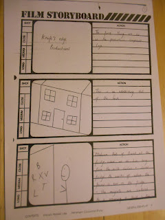
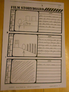
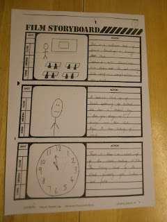
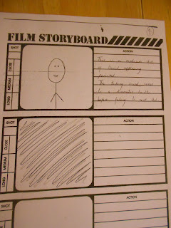
After finishing our trailer plot for our new idea, the next step was to storyboard this. In order to make good use of our time and so we could start filming as soon as possible, we divided the plot into four, where each member was to storyboard a section. From this, we are able to plan out time effectively by planning what shots will be filmed on what days. This will organise the production whilst also making sure we meet the deadline and gives us plenty of time to work on editing .I will upload the full storyboard in the next post. Below are some examples of the storyboards I produced:


Monday, 28 January 2013
Trailer Plot
The trailer
starts with an establishing shot of the house. Then it cuts to a
medium shot of David taking a drink from the fridge. When he closes
it, we see the fridge door with magnets all jumbled up. There is then
a tracking shot of him picking up his props from the table before
starting to leave the house in a shirt and tie with a briefcase and
coffee flask. When he gets to the door, he then looks over his
shoulder and shouts “See you later Love”, before it fades out to
long shot as he walks away. This fades in to a classroom where he’s
teaching a science class.
He is
stood teaching biology to a sixth form class with a diagram of a cell
on a whiteboard behind him. He begins to talk about how bad cells can
lead to complications – “When a cell’s chromosomes do
this…..complications can arise”. He appears distant before a
student asks if he’s okay. Then the student’s voice fades out and
everything becomes muffled. As a clock begins to tick, getting louder
and louder, the teacher’s face appears panicked and upset, before
returning to normal where he asks, “Where was I?” The scene then
cuts.
We then
see him sat on the edge of the bed crying. Once again, the clock
reads 11:57 and on the bedside table is a vase full of flowers.
The next
scene, we see him in the school once again. This time he catches a
glimpse of something in the corner of his eye. He looks out the
window to see his neighbour leaving the school grounds, this peculiar
because the neighbour has no children of his own. Shortly after, he
is called into the headmaster’s office where she tells him she
thinks its best he takes some time off after everything that’s
happened.
The next
scene shows him at the door talking to the neighbour. He appears a
lot more dishevelled (messy appearance and clothing) with a shirt
sporting a stain and pyjama bottoms. The neighbour says, “Look
David, a lot of us are worried about you. We know about the job and
the” David then interrupts him with “I’m coming love”,
talking to someone in the house before saying to his neighbour “I
don’t know what weird, sick game you are playing but leave me and
Lisa out of it”. He slams the door. He looks down after shutting
the door to find his letters have been opened. He looks confused but
suspects the neighbour.
In the
next scene, we see him washing his face in the mirror and he hears a
man's voice saying, “You've got to move on, there's nothing you can
do”. The next scene shows him in the living room flicking through
channel after channel. It fades out and shows him doing it over a few
days before music from a piano seems to wake him up from the trance –
clubbed to death piano solo. He walks into another room only for the
music to stop. The silence is then pierced by an alarm clock with the
number 11:57 visible. Behind David we see his neighbour spying
through the window out of sight of David.
Next we
hear half of a conversation, “So what do you fancy doing today,
Honey? Just staying here? Sure if that's what you want” He then
begins to hear ticking again as it approaches the same time as in the
school. He looks over to the fridge to see the magnets arranged into
words with a time underneath - “It's your fault 11:57”. He panics
and becomes frozen to the spot when the sound of trash cans falling
over snaps him out of it. He runs outside to see what it is just in
time to see his neighbour try and run away. He catches him and asks
what he's doing, when the neighbour replies, “Don't worry, you'll
be looked after”.
The next
scene shows him in the house. As he looks around, rooms begin to fade
away until it is just Lisa's room. To check he goes in to find it
torn up and messy as if there was a struggle. He runs outside just in
time to see a car pull off.
The
film begins to pick up pace showing various scenes of David breaking
down. These scenes are completely silent and in slow motion with the
exception of the song playing over the scene as he breaks down in the
corner, smashing plates, rips posters from the wall etc. We then see
him in a room where the walls are covered in photos. The music begins
to slow down as the scene slowly fades out and the stops completely.
He wakes up in an unknown room where a nurse walks in saying the
doctor will see you now. In the final scenes there is a black screen.
We hear footsteps before it cuts back in and his neighbour walks in
and smiles maliciously.
New Film Plot
David, aged 23 has a good job working as a biology teacher in his local comprehensive school, where he has a good relationship with the pupils and his fellow teachers. The film begins where we find David at a graveyard. He is sat in front of a grave stone, where he places a bunch of flowers. To whom this belongs to is made unknown to the audience.
The audience then see David whilst in a lesson. He is taking a lesson on the topic of cancer, which causes him to act out of character. His usual happy self now appears uncomfortable and agitated. His odd behaviour continues, when the next day we see him check the time, this reading 11:57. This seems to alarm David, leaving him flustered. Hoping the children don’t notice, he swiftly sets the class a task, and he sits down at his desk in order to try and contain himself. He sits staring into space as if in deep thought, acting unusual to his normal character. David obviously seems distressed to his colleagues who advise him to take time off and work through his problems.
David is now at home, when someone knocks on the front door. He answers to find his next door neighbour who has come round to check how things are. They have a brief conversation; however, he can hear someone playing piano in the house, although this is actually in his head. This distracts David, causing him to appear distant. This concerns the people around him even more.
When the neighbour leaves, David returns to the house. While doing so, he calls upstairs, “It was only Mr Andrews again, want a cuppa love?” There is no reply and David pauses. The piano stops playing as he realises there isn’t actually anyone in the house. He returns to his kitchen to find the mornings post open which he has no recollection of. He then walks further into the room to find a message on the fridge. The message reads 11:57, the same time in which triggered his odd behaviour in the classroom. At this point, the man is convinced there is someone in his house leaving him in a paranoid state. Hearing the slightest of noise makes him overly suspicious, unable to feel comfortable in his own home, constantly feeling on edge.
David starts calling the name “Lisa!” hinting to the audience who he believes is in the house. He begins searching around the house calling her name, behaving irrationally. He hears the piano playing once again, which leads him to a particular room. The room is full of mementos, where there are photos of a woman, presumably Lisa, plastered all over the walls. It now appears that Lisa is or was someone incredibly close to David, and was very important to him. This seems to be too much for David, where we see him emotionally breakdown.
The film ends with David in a mental hospital. It is revealed that Lisa was in fact David's long term partner, who had died of cancer. David had difficulty dealing with what happened, unable to let go, where he continued to live as nothing had ever happened. This became too much for David, resulting in him being sectioned.
Friday, 11 January 2013
The Others Poster Analysis

The tagline, “Sooner or later they will find you” suggests that someone is hiding from something, therefore showing the characters are faced with fear in the film. This creates a sense of mystery as nothing is hinting at what the characters are hiding from.
This idea is strengthened through the main image. The actor is included, positioned to the left of the poster. Being surrounded by darkness, whilst holding a light, emphasises the idea of hiding from something. A great sense of fear can be identified with the character due to her facial expression, appearing on edge and anxious.
The only star mentioned on the poster is Nicole Kidman, this made prominent by being placed directly above the title. This makes her name easily recognisable, possibly making the actor a unique selling point of the film, and it also shows she is the main character.
The credits are found conventionally at the bottom of the poster. From this we can see that the director is Alejandro Amenabar. He is a successful Spanish director, yet not that well-known. With his name being situated within the credits, and not made a feature of within the poster, suggests this is used as a main selling point relying more so on the actors and mysterious element of the film.
Although the film is certificated 15, I think it would also reach a more mature audience. For this reason, I think the target audience ranges up to adults of the age of 40. The main experience/pleasure displayed in the film is the mysterious element provided, as there is a great sense of fear created, without giving too many hints away as to what is the cause of this. It makes the audience want to watch the film to find out.
Wednesday, 9 January 2013
What Lies Beneath Poster Analysis
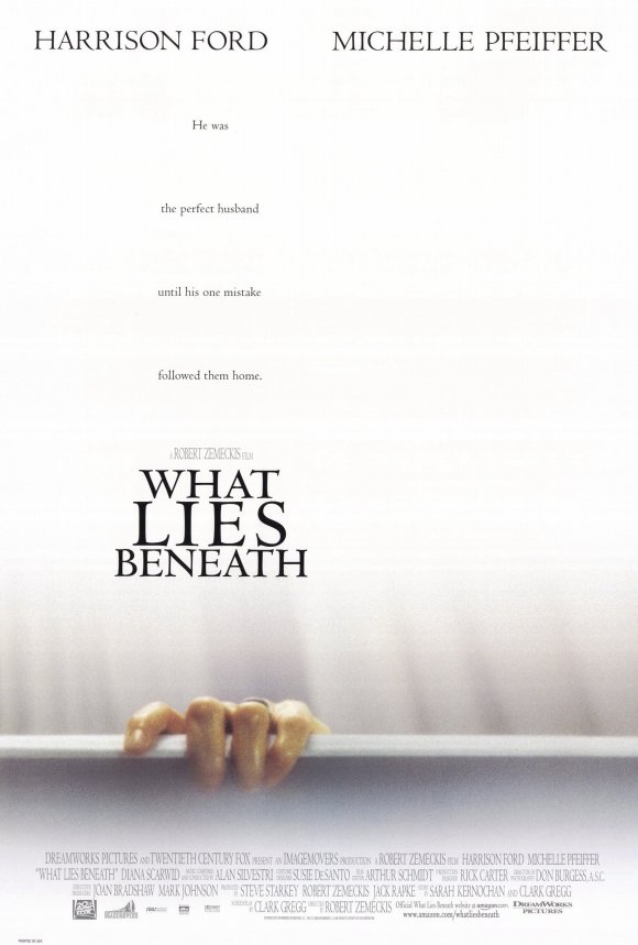
The main image is of a hand, gripping onto the edge of the bathtub, a ring on it's finger hinting this could be the wife. This creates a great sense of mystery and shows the audience someone is in trouble, in need for help as if gripping for safety. The image is simple, yet effetive with the sparse white background creating even more mystery, nothing more is given away through imagery.
The film's stars are Harrison Ford and Michelle Pfeiffer, both well known actors but not seen on the poster. There names are clearly placed at the top, their positioning sugeseting equal status.
The credits are conventionally found at the bottom of the poster, the director's name however is placed above the film title. Robert Zemeckis is well established director, and with his name positioned amonst the poster, rather than in the credits, shows his name would likely be recognisable to the audience. He is a well-known and successful director. However, this is in much smaller print to that of the actors, suggesting these are more of a selling point than the director may be.
I think the unique selling point here is the great sense of mystery that is given, along with the actors. The film is certificated 15, yet I believe the target audience would reach a maturer audience being able to relate to the married relationships and the conflicts that can arise. The maturer actors as sellign points adds to this. The film would also appeal to both genders.
Changes made since the animatic
As a result of producing an animatic, the group found our original ideas weren't working. This was mainly due to the fact that they weren't capturing the codes of conventions of our chosen genre. Because of this, we have come up with a new plot, which is alot simpler that will be easier to portray in a trailer. It also follows the conventions of a psychological thriller much better than previous. We got to this stage by doing a greater amount of research, where as a group we looked at specific exmples, such as Shutter Isand and Memento in order to help with our new ideas and give us inspiration. With this, we have now created our trailer plot, which will be uploaed in a later post. The next stage is to storyboard this, before going on to film.
Subscribe to:
Comments (Atom)


